By Deborah Köngeter | Posted on 27. 1. 2023 | Updated on 22. 9. 2023
Individualized greeting card with illustrations for the turn of the year 2022/2023
Every year we send our customers, partners and other business contacts a New Year's greeting, which we have been using for some time now with our own software ManyPrint Solutions individualize. Last year we decided on an eye-catching, unmistakable individualization effect by generating posters with the first names of the respective recipients as part of the card (More about the 2021/2022 greeting card).
For us, content individualization is even more important than effect individualization. That's why our focus this year was on creating text variants and personal text additions, so that our card is not only individual, but also more personal.
As food for thought for the new year, we have added one to five texts — depending on the length of the card — that show future-proof solutions for the printing and media industry.
Text and associated illustration variants make each card unique.
Basics
Dataset contents
Of course, the same applies this time: without data, there can be no individualization. What is always important to us: We only use data to a limited extent and carefully select which data is used, communicate openly which data we use, protect the privacy of the recipients and comply fully and happily comply with the requirements of the GDPR.
The following applies to the New Year's card: As every year, we use the data that is absolutely necessary for a letter: salutation, name, address and company brand with which the person is in contact.
Before making a decision about the use of additional data, the question is always whether the use of the data offers added value for the recipient. After working with first names last year and being asked, especially by people who were not particularly familiar with automation, how personal the card was and how much work went into it, we realized that although we had very individual, but actually didn't process any actual personal content at all. That's why our personalization goes a little further this year. For example, we have compiled information about encounters or joint projects in a large database, which has now been incorporated into the cards for some people. This brings us a little closer to our actual desire, an actual individualization of content.
Technical basics
We do not use artificial intelligence for our layout customizations; on the contrary, our layout automation software ManyPrint Solutions works according to the logic of a human designer. In a specifically programmed application, predefined design rules were stored as the basis for the layouts, which were then supplemented with so-called generation logic.
After the design is in place and the application has been programmed, the layouts can be generated. This means that our applications first generate an IDML document for each recipient, which is then automatically converted into a printable PDF.
Layout basics
In general, our application works with design specifications, not with templates that are applied to a document — analogous to the work of designers. Our application generates a separate layout document for each recipient, the scope of which depends on the individual amount of content.
This year we decided to use variants in the design specifications that are used depending on which part of the company — the umbrella company or one of our corporate brands — a person is assigned to. In addition to the same handwriting in each card, in contrast to our previous cards, which were designed based on the corporate design of our umbrella brand, we have the respective corporate fonts in the various versions for better recognition value used.
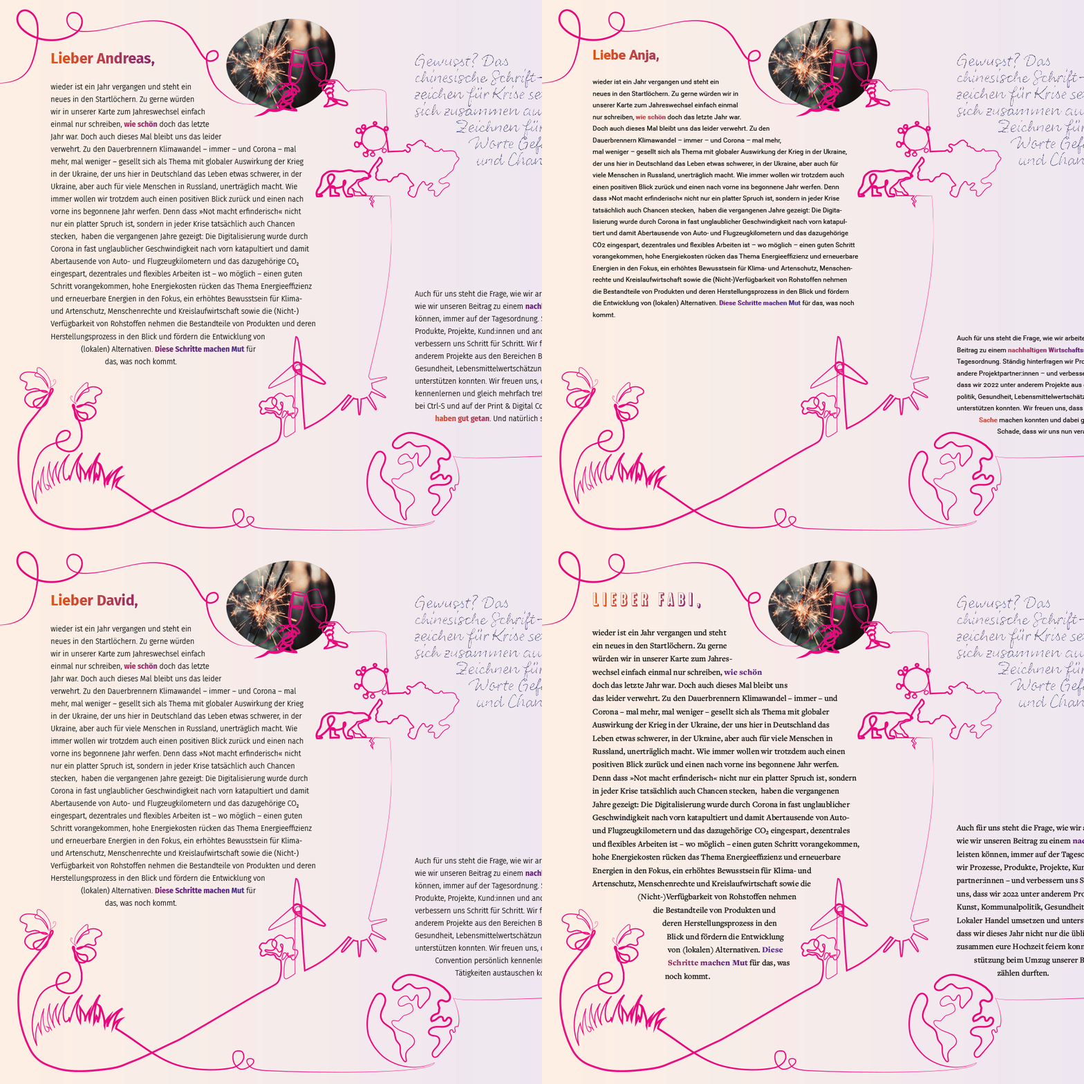
Individual information influences the length of the text and the number of pages. The combination of 6 different design variants and 4 different formats results in a total of 24 basic possible versions of the card.
Like every year, the New Year's card is a field of experimentation for us. That's why we tried things this year that we've never done before.
Responsive illustrations
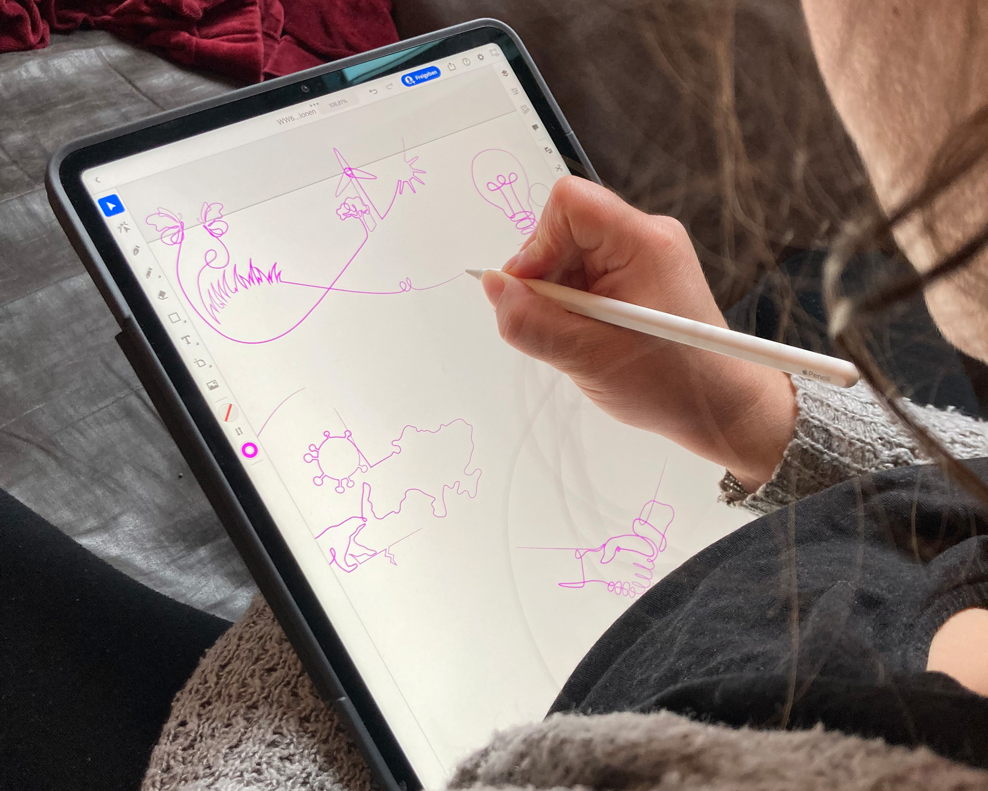
Responsive handling of texts and associated individual graphics is standard in our cards. But this year we wanted to know: Inspired by the currently ubiquitous one line drawings, our goal was to turn various drawings belonging to the text into one long, completely coherent one, with the lines between the individual drawings depending on the length of the text and text content varies — a responsive illustration.
Although we decided on two illustrations during the development of our card, the basic idea remained:
Two one line drawings change from the front to the back or vice versa and vary in length and number of building blocks — depending on the length of the card and the number of text blocks.
A combination of individual building blocks with fixed anchor points and flexible intermediate pieces create the complete drawings.
Image-individualized messages
We already regularly use image customization, for example in the form of automated cropping and/or adjustment of the background, in customer projects. It is important to us that individualization is not just about the effect, but rather serves as an additional level of information, supplement or for better recognition.
Over the past year, we have therefore increasingly dealt with another form of individualization of images, namely image-individualized messages that accompany and complement the text contained in the cards. As always, the following applies to us: Individualization should offer added value and be integrated sensibly, for example highlighting and underlining a certain part of the text.
Greeting card
When designing the greeting card page, there are interactions between the text fields and the illustrations. The position of the illustrations and the length and design of the lines depend on the length of the text. The shape of the text fields used is defined by a combination of a fixed type area minus distances to the illustrations, which must be kept free of text.
Good news
The good news from the printing and media industry follows a simple logic: They are consistently arranged at the top and bottom of the pages in order to leave space in the middle for suitable illustrations.
Colors
This year we decided on a color gradient from magenta to cyan to yellow, which is used on both sides of the card.
The lines of the one line drawings are kept in pure magenta. This means they offer a clear contrast to both the traditional blue of the front page and the gradient.
Customizations
Texts
The individualized and personal texts were our top priority this year. Personal exchange and therefore personal words at the turn of the year are very important to us. That's why, as every year, there is a raw text with many variables. The technical implementation is the same as before — what has changed for us in the background is the database content, which has grown to include personal words as well as places of encounter or joint projects.
What is used as usual are variants for an informal or formal and a male or female address, which are used depending on the database information.
Finally, the text wrapping, which varies in each document depending on the individual text variants, is improved by our company's hyphenation program Hyphenizer so that the text ultimately wraps as if it had a designer edits it manually line by line.
one line drawings
First, individual elements were drawn that complemented the text thematically. All drawings have fixed anchor points assigned to the respective parts of the text. Between these points lie flexible lines that connect all the drawings into a complete line and are more or less sweeping depending on the length of the line and the available space.
Corporate fonts
The respective corporate fonts of the individual brands are used in the headings within the card and on the cover.
Automation
As soon as the logic of the individualizations and the design rules developed for the design have been determined, the fully automated creation of the layout and the texts can begin.
Our application not only creates the cards themselves, but also the envelopes automatically. In addition to the sender and recipient addresses, the logo of the respective company brand with which the collaboration takes place is shown.
Manufacturing
The cards have different formats depending on the length of the text. When closed, they are 140 × 210 mm based on the DIN A5 format.
The cards were printed by the Abt Mediengruppe on a Fuji JetPress 720s on the paper Jupp Wiess by Römerturm in 160 g/sqm.


