By Deborah Köngeter | Posted on 18. 1. 2022 | Updated on 22. 9. 2023
Individualized New Year's greeting for the turn of the year 2021/2022
Every year we receive numerous Christmas cards, many of which are very general and not particularly unusual. Of course — in very few companies can the many greeting cards be lovingly written individually by hand. Not with us either. On the other hand, not only a handwritten card expresses appreciation for the recipient, but also a card that shows that someone has given it some thought.
Our customers, partners and other business contacts can also look forward to a card at the turn of the year every year and, like last year, we have individualized our cards. Each card is only available once! What could be more obvious to us, as we are constantly expanding our software ManyPrint Solutions, with which we want to seize the opportunities of digitalization and use the possibilities of digital printing and finishing machines as extensively as possible.
Customizations — especially unobtrusive, well-integrated customizations — are our specialty. At the turn of the year, we also used our own software and sent personal New Year's greetings. Our specialty is inconspicuous, yes — so inconspicuous that the individualization often goes unnoticed by the recipient. Good for the recipients and a good result of our work, a shame for a company that wants to show what it can do and whose ability lies in the fact that the individualizations fit perfectly into the card. That's why we wanted to do it a little differently this year.
We enjoy constantly exploring what possibilities our software offers and with what individualization we can surprise the recipients, and so the New Year's card is a welcome playground for us where we can let off steam creatively. Which data do we want to use, how do we enrich it, visualize it, link it, and how does this result in a product that is appealing in terms of content and appearance?
We have given ourselves three framework conditions for the development of the ideas:
- Only as much data as absolutely necessary is processed.
- The card should not be a disposable product, but rather serve a second purpose in addition to the greeting card part and the annual review and outlook.
- There should be elements of obvious individualization.
Like last year, we have solved the first point: only the data that is required for mailing is used, i.e. salutation, name, address and, for the sender address, the company brand with which the recipient has worked. Not more.
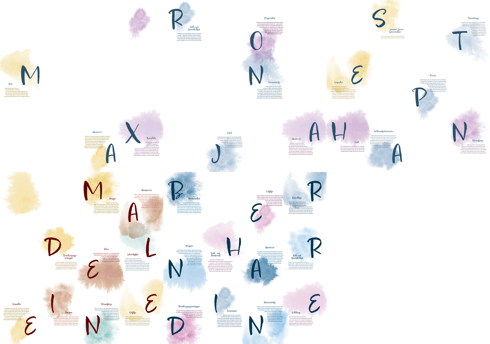
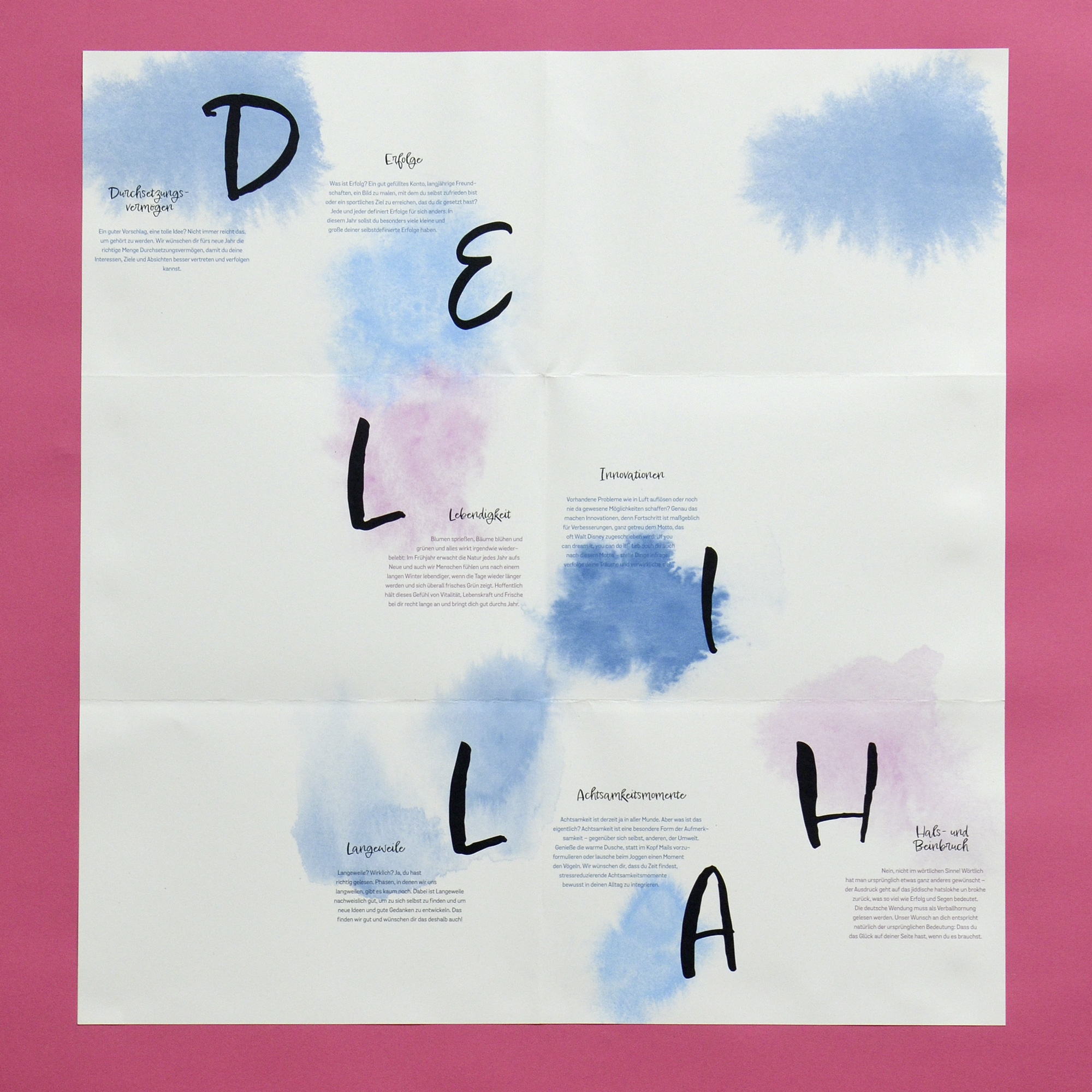
For the second point, we thought a little longer and collected various ideas — from seed paper that can be planted, to reusable postcard motifs, to a calendar so that the card still serves a purpose all year round. Ultimately the decision was made for a poster. It leaves room for creativity and can be used beyond the lifespan of a greeting card. This is how we live up to our sustainability standards. In addition, the card should always serve for demonstration purposes and an idea for individualization for the poster — the third point of our framework — with a New Year connection was found after a short time: Each recipient receives individual New Year wishes from us strong> — the letters of the first name determine the wishes and texts that the recipients receive.
Basics
Dataset contents
Individualization requires data. The use of personal data is controversial — anyone who notices that their own data is being used sometimes feels like they are being watched and fears disadvantages as a result of the known data; on the other hand, the storage and use of personal data makes many things easier. What is important to us: We only use very limited data and carefully select which data is used, create transparency about it, protect the privacy of the recipients and — a matter of course — fully and happily comply with the requirements GDPR requirements.
The following applies to the New Year's card: We only use data that is absolutely necessary for a letter. The decision about which data to use is always preceded by the question of whether the use of certain data brings added value for the recipient. For New Year's cards, the data mentioned is absolutely sufficient: salutation, name, address and brand with which the person is in contact.
Technical basics
Contrary to what is often assumed, there is no artificial intelligence behind our individualizations, but rather a specially programmed application. As a basis for the layouts, our software requires, on the one hand, design rules predefined by designers, which are mapped in the programming in PHP code, and, on the other hand, cleanly structured data sets.
After the design is in place and the application has been programmed, the layouts can be generated. This means that our applications first generate an IDML document for each customer, which is then automatically converted into a printable PDF.
The complete process to generate a single greeting card takes approximately 7 seconds.
Layout basics
Basically, our application generates a layout document for each recipient, the design of which is based on precise design specifications. The design of the greeting card is based, on the one hand, on the corporate design of our umbrella brand, WirbelWild, and on the other hand, on the respective colors of the corporate brands with which we work. In addition, the design should convey something handmade, which is why we chose watercolors and handwriting for the poster.
Greeting card
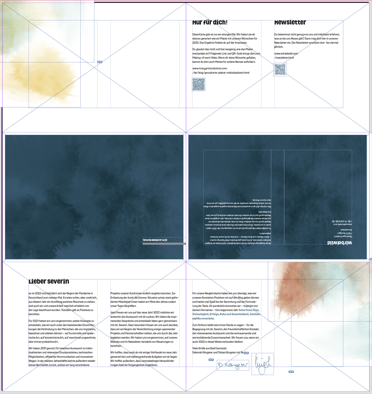
A grid was developed for the design of the greeting card page, which helps to use the respective elements. Among others, it defines
- Areas to be filled in, such as the type area, and
- Areas to be kept clear
and is the basis for defining further design rules, for example the arrangement of the watercolors.
Poster
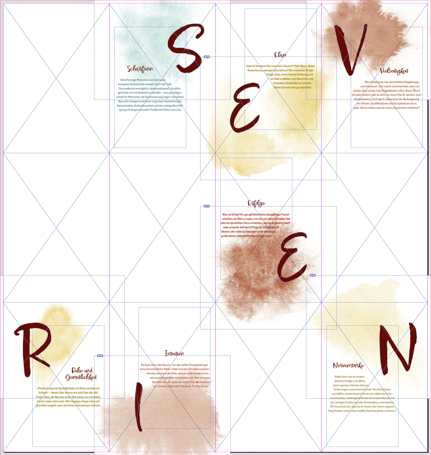
The poster page is divided into 4 by 3 tiles. Depending on the number of first name letters, all or some of the tiles were filled.
We have also developed and programmed design specifications for the individual tiles. The design specifications for the individual tiles aim to loosen up the strict tile grid and create a varied image. The different watercolors are sometimes in the upper half, sometimes in the lower half of the tiles and also extend over them Tile edges, so they can overlay like an actual watercolor drawing. Letters and text are randomly placed on the right or left in the still free half.
Colors
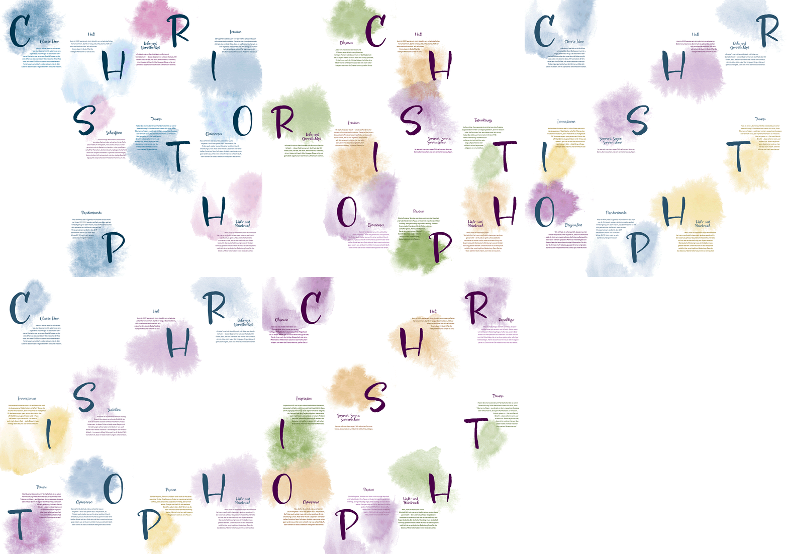
The color selection for our print product is based on the corporate colors of our company and our corporate brands: WirbelWild, Siegertypen, Bit&Black, Calidario, ManyPrint Solutions, SchwarzKunstWerk and Loopyball Stuttgart. We have added two additional colors to each main corporate color. For example, a Bit&Black customer receives the corporate color purple combined with green and orange.
Customizations
Watercolors
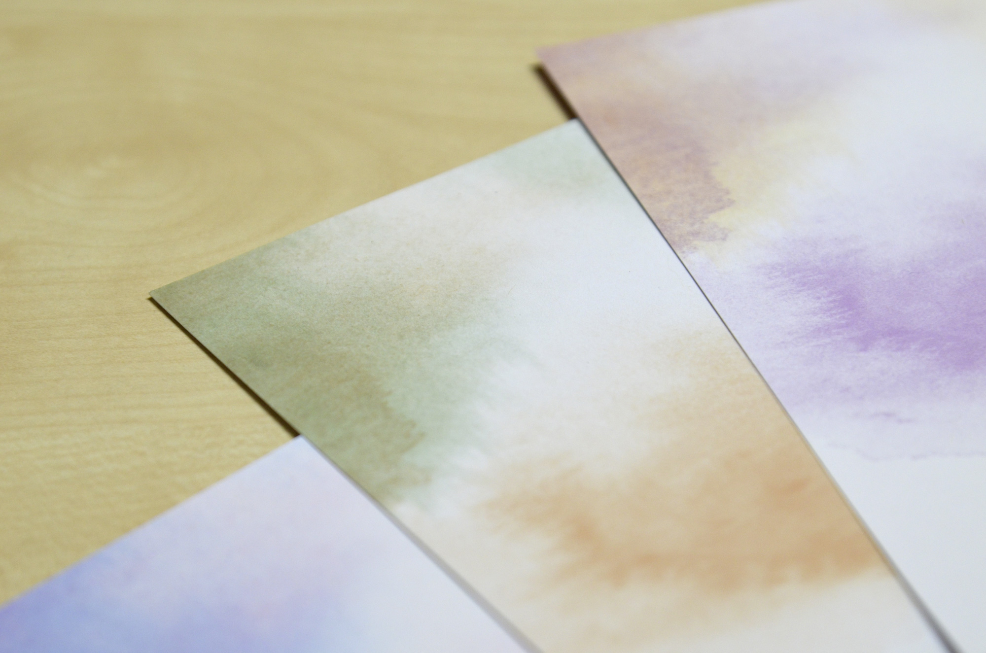
Initially, watercolors were painted, the color of which played no role — details such as shape or opacity were crucial. We then prepared the scanned and cropped watercolors in such a way that when generating the layouts, the watercolors can be automatically colored with the colors of the prefabricated color schemes.
Texts
Finally, the texts are individualized. We have created a database for both the text variants of the greeting card and the text modules of the poster.
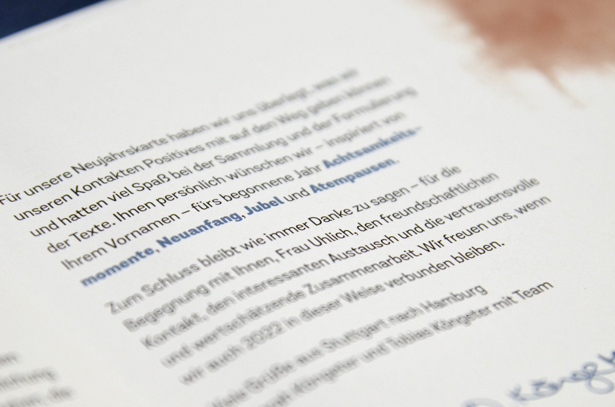
In the greeting card, variables for different variants — including for an informal or formal and a male or female salutation — were used in the raw text, which are filled in based on personal data. The text wrapping, which differs in each document due to the individual text variants, is then created by our company's hyphenation program Hyphenizer< /a> improved so that the text ultimately wraps as if a designer had edited it line by line by hand.
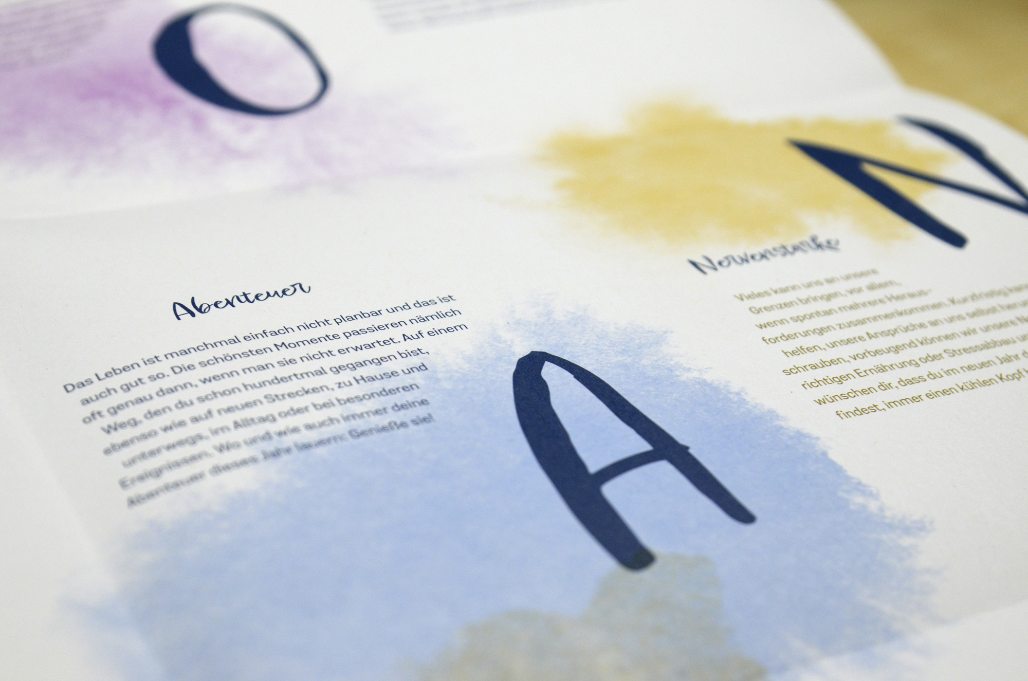
For the poster, the letters of the first name are supplemented with the letter-dependent texts from our wishes database. The database contains three terms and associated texts for each letter. In some cases, these texts also contain variables, which in turn are filled in with the personal data.
Automation
As soon as the logic of the initializations and the design rules developed for the design have been determined, the fully automated creation of the layout and the texts can begin.
Creation of the tiles
Our application takes care of both the arrangement and the filling of the tiles.
To arrange the arrangement, our software goes through each tile one after the other and first determines whether a tile should be filled or remain empty. When it comes to the question of arrangement, we have defined some specifications and otherwise let the software arrange the tiles randomly, so that there are variations in the arrangement of the letters on the poster even with names of the same length.
Tiles selected for filling go through the process described above and our application must decide where to place the watercolor and texts. For particularly short names, we decided to fill the very large white space with more watercolors. Here too, the software decides which watercolor is used and where it is placed.
Color of the brand
After the layout has been completed, the watercolors and the texts are colored with the colors of the corresponding color scheme depending on the brand affiliation.
Envelope
Our envelopes are also created automatically by our application. In addition to the sender and recipient addresses, the logo of the respective company brand with which the collaboration takes place is shown.
Manufacturing
The poster is in the format 42.0 × 44.4 cm, the closed format of the card then corresponds to DIN A5 in landscape format.
In keeping with our sustainability philosophy, the cards were printed on recycled paper. It is the Jupp Ech Öko from Römerturm in 160 g/sqm, which with the Blue Angel and FSC certification.
The cards were printed by the Abt Mediengruppe on a Fuji JetPress 720s and processed in a three-fold and cross fold.
Would you also like to send New Year's wishes to someone?
Please email us with the name of your choice. We generate each name for you as a PDF. If you are interested in a printed version, please let us know.
